Predictive Analytics - Oil and Gas
The Problem Statement
The predictive maintenance technology applies machine learning to sensory signal data to predict when a machine failure may occur. The goal of this experience is to raise awareness of potential failure events to increase safety and reduce costs.
Machines are setup with multiple sensors which capture data on vibration, temperature, pressure and speed. The data model then ingests all of this data, filters out the noise and then pushes alerts to the end user.
Contributions
- UX strategy
- User stories
- Content strategy Á microcopy
- System flows
- User research
- UI design
- Pattern and templates influenced design system language
Persona - Equipment Analyst
An equipment analyst's concern is to minimize machine failure and to equip their field crew with as much information as possible to address mechanical issues.
Equipment analyst jobs to do
- Investigating system generated alerts.
- Creating and assigning work orders.
- Mostly focus on managing a specified region. Equipment analysts cover for other colleague's regions as needed.
- Investigate signal data and system alerts both digitally and in the field.
Our client had 42 Equipment Analysts which managed all the units within their region. I was fortunate to speak directly with Craig, a veteran Equipment Analyst, who was also working with data scientists to validate data model rules.
Equipment Analyst's
- Receive a system generated alert to his Outlook inbox from the data model.
- Investigate the alert by performing a deep dive on the time series data (heat, pressure, speed and/or temperature).
- Leveraging his 25 years of experience, he would then assign alerts as workorders or as false positives. This would then inform the data mode. This process was done side by side with a data scientist.
Discovery
User Goals
Equipment Analyst's main goal is to ensure a booster is running at maximum efficiency by minimizing down times and prioritizing planned and unplanned maintenance events.
- Ability to understand equipment and system health across a region.
- To efficiently scan and act upon high priority alerts.
- Surface critical details to the user while also enabling the user to dive deeper into the raw sensor data.
- Give users the ability to assign work orders directly from the platform and pre populate any redundant fields into the work order.
UXR Discoveries
- In his current system, only 52 out of 400 notifications became work orders. The majority of his time was spend weeding out false positives.
- 50% of Craig's time was spent with data entry which hampered his ability to accurately assess and resource work to his team. In order to avoid typos, Craig had to copy and paste across 2 or more applications.
- 20% of his time was spent working with a data scientist persona manually validating signal data.
- 4 out of the 5 SMEs voiced concerns in trusting a digital system over "seeing it in person."
Design Strategy and Solution
Design Workshop Exploration - Defining the value add
The project kicked off at the client site with a design workshop. This workshop was critical not only for my own learning but to also validate the use case for the experience.
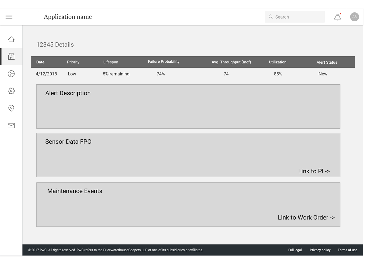
Alert detail view - a low fidelity wire to validate an alert detail's major IA components.
This wire chunked out the required information architecture for an alert detail view. This wire was used to capture user's feedback as well as to drive discussions around flow and user tasks.
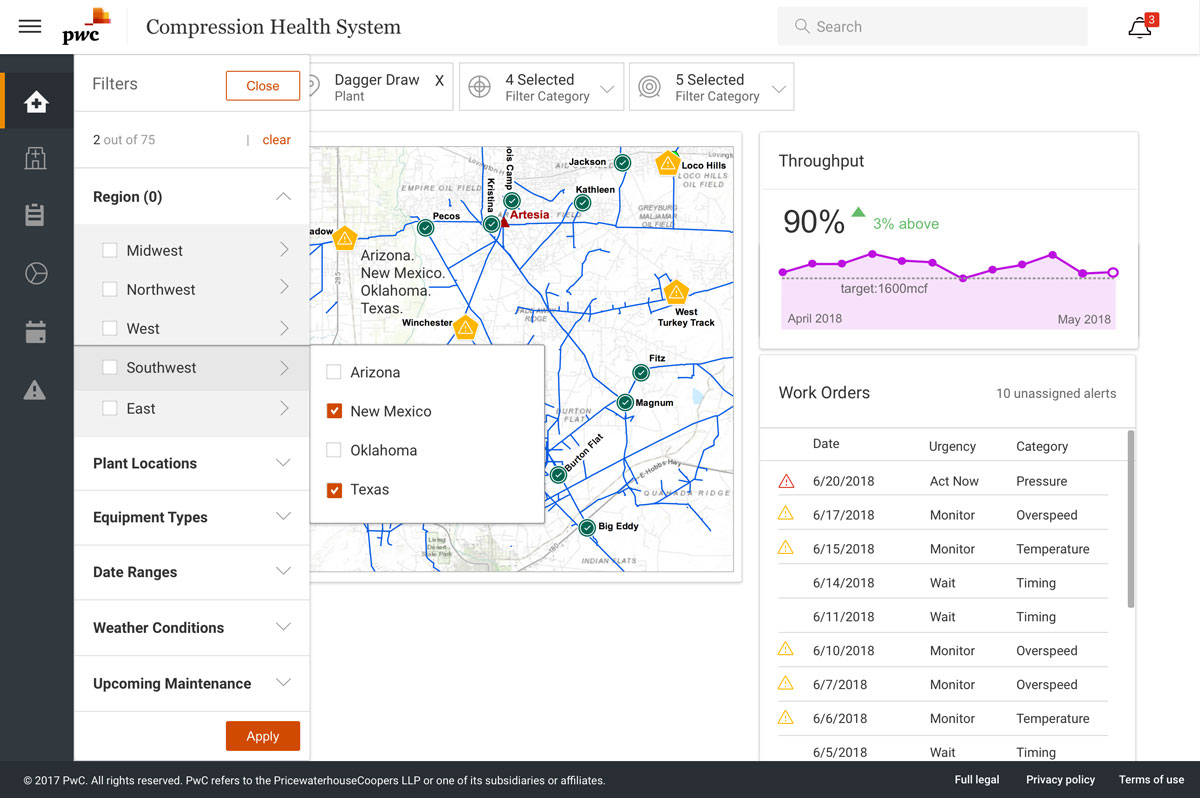
Landing page - a medium fidelity dashboard based on brainstorming sessions during the design workshop.
Filters were used to allude to IA which would fall under user permissions. Seasonal and geography based filters were discussed for modeling downtimes and natural disaster readiness.
Alert Functionality Evolution
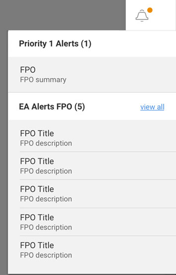
Version 1a - Initial Design
Persistent alerts menu allows for easy access and reference throughout the experience.
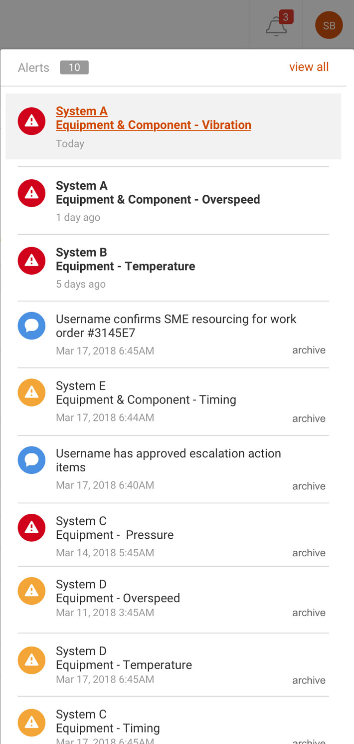
Version 1b - Layering in Fidelity
Fidelity and content were then layered into the cards. This iteration led to discussions around the need for critical interactions such as prioritization, sorting, comparing and archiving.
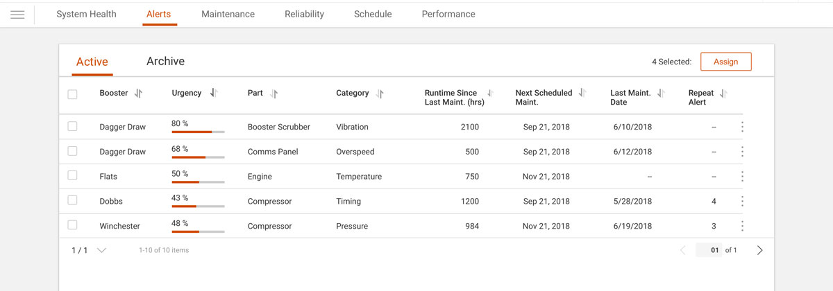
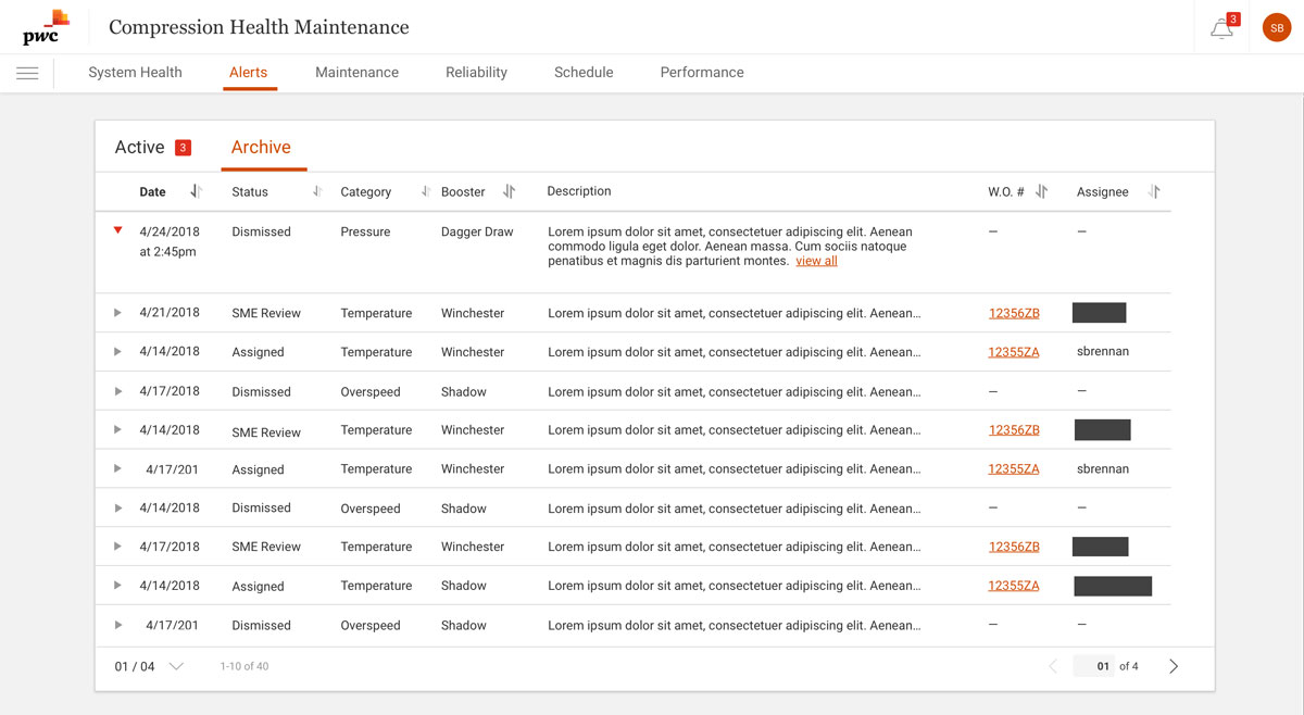
Version 2 - Dedicated Landing view
Users can more readily sort, compare and digest priority. The archive tab holds alerts for past alert and work order reference.
Alert Detail Views
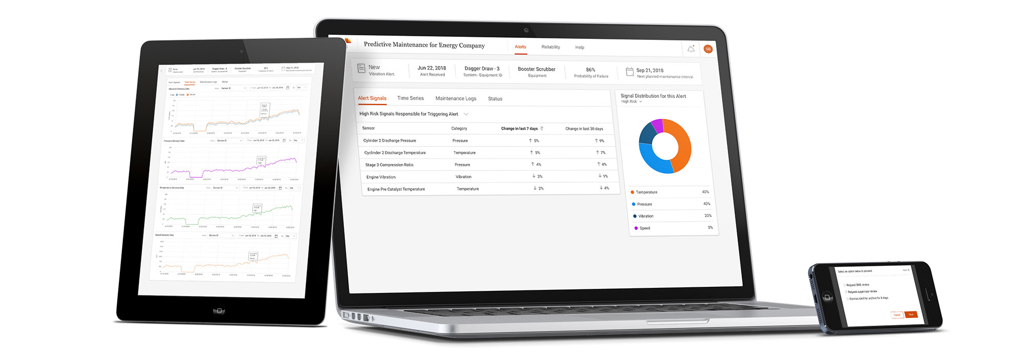
Once a user selects an alert from the landing view, the system navigates the user to an alert detail view. The user can now investigate why an alert was created, the details of the sensory readings as well as time series data visualizations. If an alert warranted further investigation, users could also assign work orders.
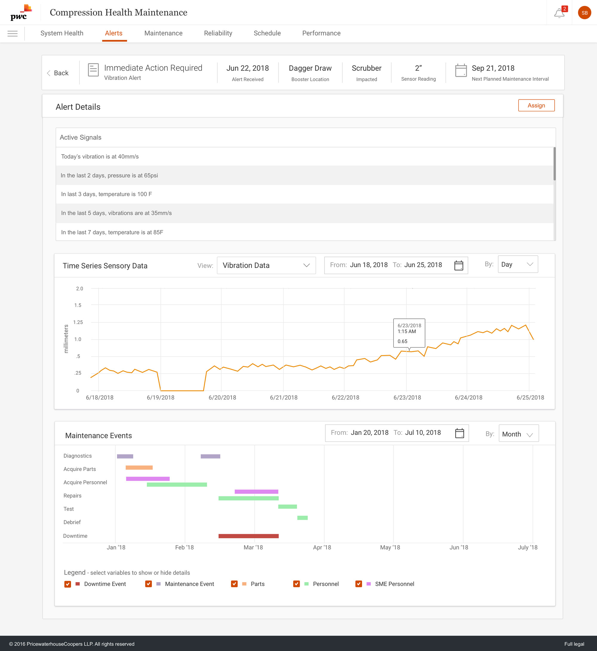
Version 1 - Alert detail flattened
This initial version consolidated sensor signal data points and time series data. Upon further validation, I learned that users needed to be able to focus more attention to the timer series charts independent of one another.
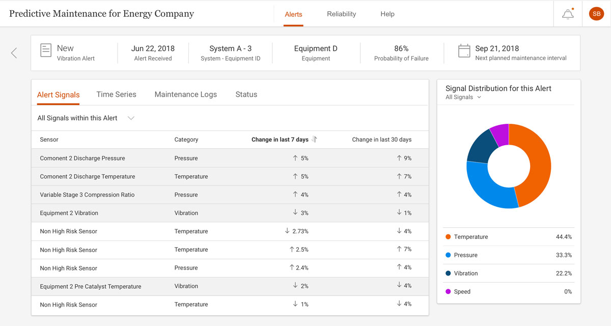
Alert Signals and Sensors
The user can filter sensor data to view all data points or data points the system defines as priority. Including all data points helped to increase trust between the users and the system.
4 of the 5 SMEs voiced concerns about trusting the system. My main contact, Craig, had over 20 years in the field and his number one concern was the safety of his crew. He wanted to be able to verify that the system was flagging sensor combinations correctly as he was not convinced the system was fool proof.
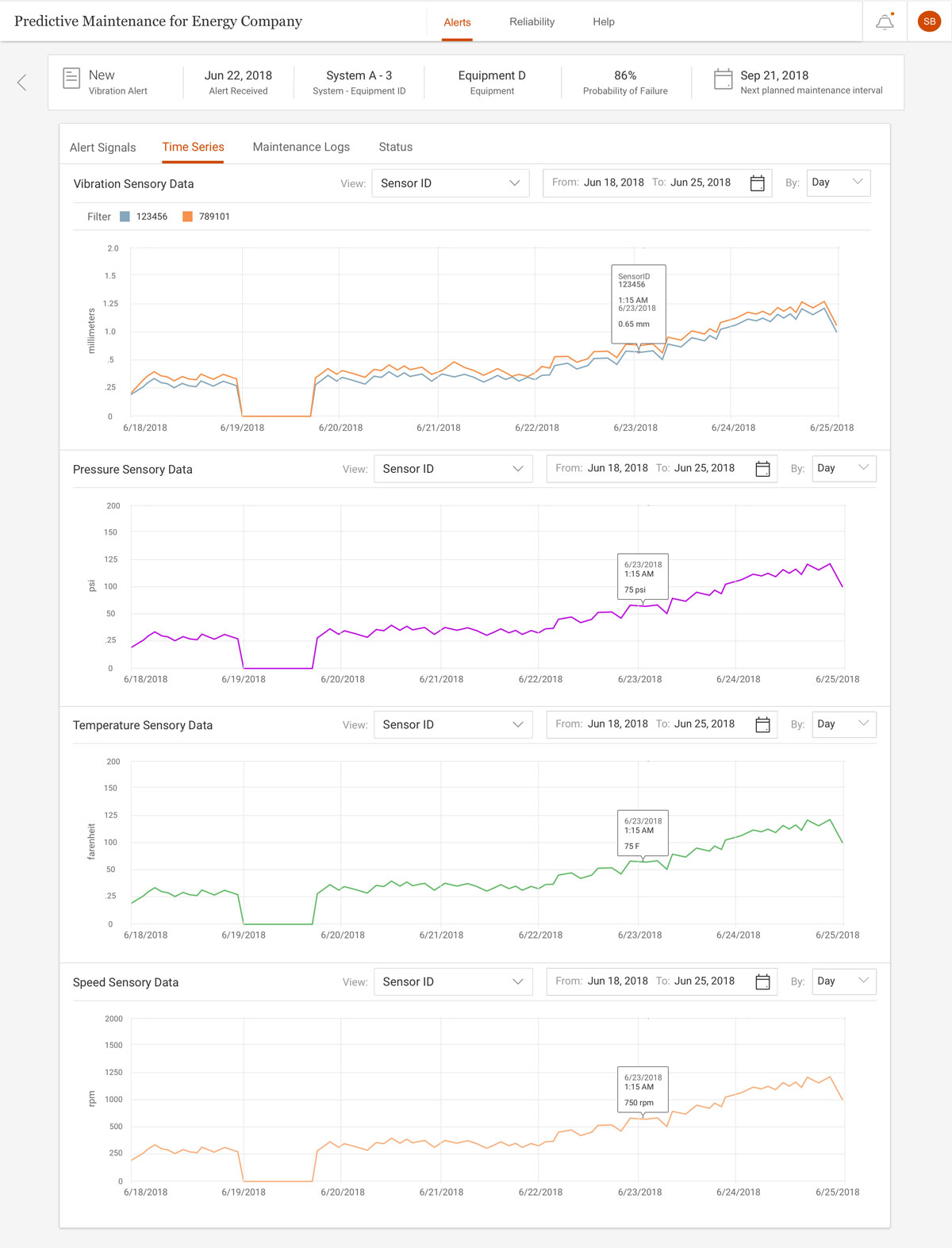
Time Series Sensory Data
Users can view and compare all time series sensor data. Users can filter by a specific sensor, zoom into a specific timestamp for further investigation and filter by date and time independently per chart.
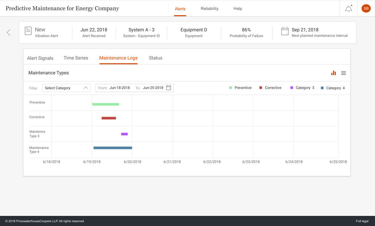
Maintenance History - Schedule View
Users can view past and current maintenance intervals.
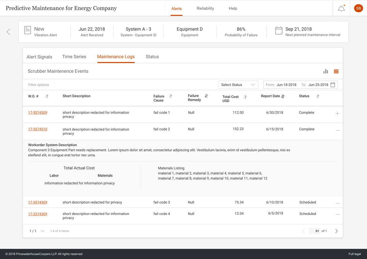
Maintenance History - Table View
Users can view work order information, materials used, total cost of repairs and other pertinent information. This more detailed information was not possible to implement due to integration issues between Maximo and the Predictive Maintenance platform (we could not pull that data).
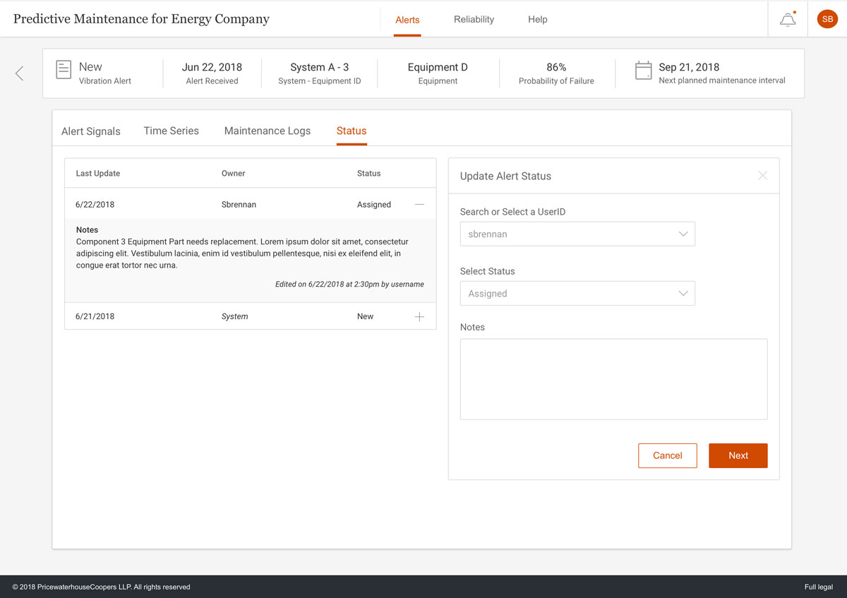
Assign and Create Work Order
Users can create a work order or update the status of an existing alert.
